Pricing Page Visitor Segmentation: Why One Page Must Speak to Three Minds
Most SaaS founders treat the pricing page as a simple display of plans and numbers.
But in reality, the pricing page is the most important decision point in your entire funnel.
Users don’t come here to just see prices.They come here to decide:
- “Is this worth it?”
- “Should I commit?”
And here’s the problem.
Not all users who visit your pricing page are thinking the same way.
The Mistake Most SaaS Founders Make
You design one pricing page.You assume every visitor is ready to buy.
But that’s not true.
Your pricing page gets visitors from different stages:
- Some are just exploring
- Some are evaluating
- Some are ready to buy
If your page speaks only to one type, you lose the other two.
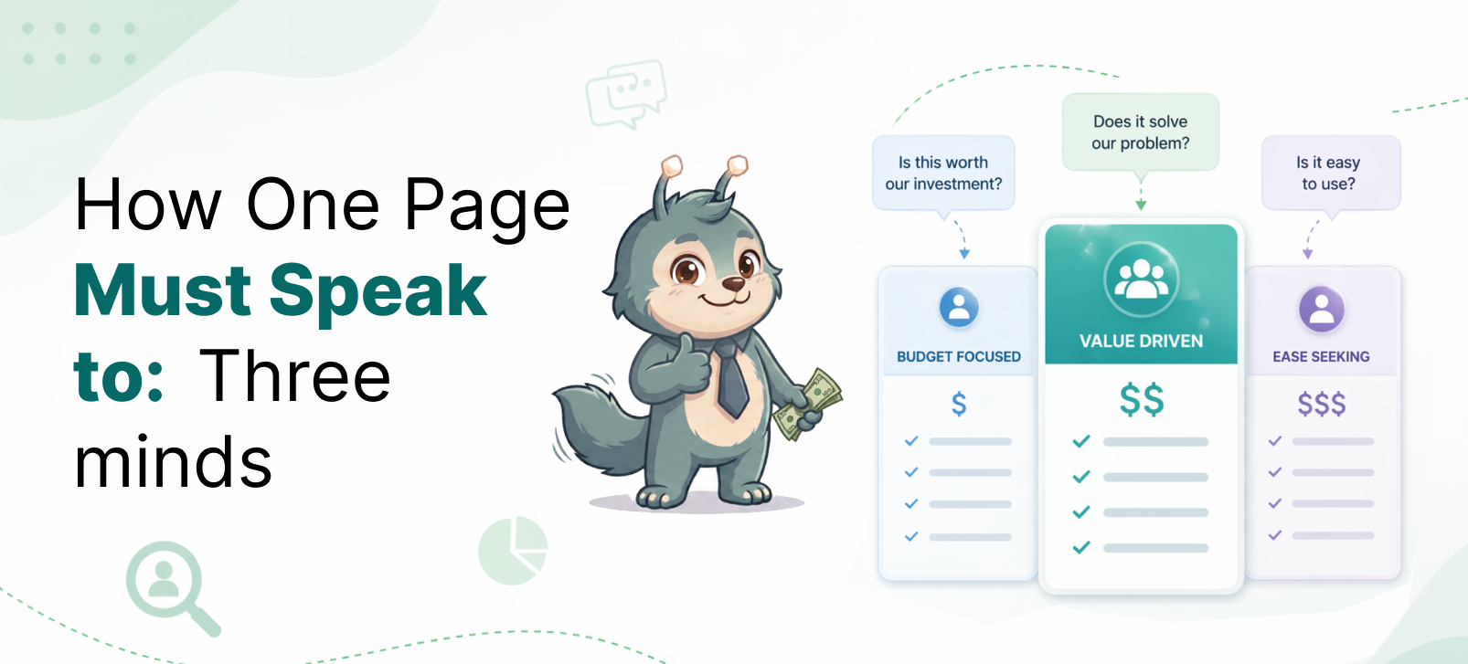
The Three Types of Pricing Page Visitors
Let’s break this down simply.
1. Explorers — Low Intent
These users are early in their journey.
They may have:
- Clicked an ad
- Landed on your site for the first time
- Heard about your product briefly
They don’t fully understand your product yet.
Their mindset is:
- “Looks interesting… but what is this?”
They are not here to buy.They are here to filter quickly.
If your pricing page feels confusing or too detailed, they leave immediately.
2. Evaluators — Medium Intent
These users are more serious.
They may have:
- Seen your features
- Compared you with alternatives
- Understood your core value
Their mindset is:
- “This could help… but is it worth it?”
They are trying to:
- Compare plans
- Understand value
- Reduce uncertainty
This is the largest segment on your pricing page.
If you lose them, your conversion drops significantly.
3. Buyers — High Intent
These users are closest to conversion.
They:
- Understand your product
- See its value
- Are considering signing up
Their mindset is:
- “I want this… which plan should I choose?”
But even here, they can drop off.
Why?
Because something still feels unclear or risky.
Why This Segmentation Matters
If you treat all users the same, your pricing page fails.
Because:
- Explorers need clarity
- Evaluators need confidence
- Buyers need reassurance
A single message cannot solve all three.
What Each Segment Needs from Your Pricing Page
Let’s simplify this.
For Explorers → Clarity
Explorers should quickly understand:
- What your product does
- Who it is for
- Why it matters
If this is missing, they leave in seconds.
For Evaluators → Confidence
Evaluators want:
- Clear plan differences
- Value explanation
- Use-case clarity
They are comparing mentally:
- “Is this better than what I use today?”
If they feel confused, they don’t move forward.
For Buyers → Reassurance
Buyers are almost ready.
They just need:
- A clear choice
- Low risk
- Confidence to act
They ask:
- “What happens after I sign up?”
- “Will I get stuck?”
If you don’t answer this, they hesitate and leave.
One Page, Three Jobs
Your pricing page is doing three jobs at once:
- Educate (for explorers)
- Convince (for evaluators)
- Convert (for buyers)
Most SaaS pages only focus on the third.
That’s why they underperform.
How to Design for All Three Segments
You don’t need three pages.
You need one structured page.
1. Start with clarity (top section)
At the top, clearly explain:
- What the product does
- Who it is for
- What outcome it delivers
This helps explorers stay.
2. Make plan comparison easy (middle section)
In the pricing section:
- Keep features consistent across plans
- Highlight only what changes (like usage or limits)
- Add “who this plan is for”
This helps evaluators decide.
3. Add reassurance (bottom section)
Below pricing, include:
- “No setup required”
- “Start in 2 minutes”
- “No coding needed”
This helps buyers convert.
Where Most Pricing Pages Go Wrong
Here are common mistakes:
- Too much focus on features
- No clear target user per plan
- Confusing differences between plans
- No guidance on which plan to choose
- No reassurance about what happens after signup
All of these increase hesitation.
A Quick Way to Check Your Pricing Page
Ask yourself:
- Can a new user understand this in 5 seconds?
- Can an interested user choose a plan easily?
- Can a ready user commit without fear?
If any answer is “no”, you’re losing conversions.
A Note on Behavior Signals
Everything we discussed can also be validated using behavior data.
You can observe:
- How long users stay
- What they click
- How they scroll
- Where they exit
These signals help you identify whether a user is:
- Explorer
- Evaluator
- Buyer
This is a deeper topic and deserves a separate discussion.
Final Insight
Your pricing page is not just about pricing. It is where users decide whether your product is worth their time, money, and effort. And different users reach this decision in different ways.
If You Remember One Thing
Your pricing page must speak to three minds — not one.