Where Users Actually Give Attention on a Webpage
Most websites try to collect emails too early.
A user lands on the page.
Within a few seconds, a popup appears.
“Subscribe to our newsletter.”
But the user has not read anything yet.They have not received value.They have not built trust.They have not decided whether the page is useful.
So they close it.
Not because they hate newsletters.Not because they never subscribe.
They close it because the request came before attention was earned.
That is the real problem.
Most websites ask for action before the user is mentally ready.
- Attention Comes After Value
Users do not give attention just because something appears on the screen.
They give attention when something feels useful.
This is important.
Visibility is not attention.
A popup may be visible.A CTA may be visible.A signup form may be visible.
But the user may still ignore it completely.
Why?
Because the user is busy answering one silent question:
“Is this useful to me?”
Until the answer is yes, everything else is noise.
A user starts paying attention when they get something valuable first.
Maybe they read a useful paragraph.Maybe they get a fresh insight.Maybe they solve a small problem.Maybe they feel understood.
That is the moment their brain opens up.
They move from:
“I am just browsing.”
To:
“Okay, this is useful. Maybe I want more.”
That is when email capture starts making sense.
Not before.
If you ask before giving value, the ask feels like an interruption.
If you ask after giving value, the ask feels like a next step.
That difference matters.
- The Natural Pause Is a Conversion Moment
Users should not be interrupted when they are in the middle of doing something.
If they are reading, let them read.If they are comparing, let them compare.If they are filling a form, let them finish.If they are trying to understand something, do not break their focus.
A better moment comes when the user reaches a natural pause.
This could be:
- the end of an article
- the end of a section
- after completing a task
- after scrolling through most of the page
- after spending time on a useful explanation
At that point, the user is no longer in the middle of the thought.
Their brain has space for the next step.
That is why an email form at the end of an article often feels better than a popup at the beginning.
The first one interrupts.The second one continues the journey.
A natural pause is powerful because the user has already consumed something.
They have enough context to decide whether they want more.
So instead of asking, “How fast can we show the popup?”Ask, “Where does the user naturally pause?”
That is where attention already exists.
- Attention Comes From Need, Not Interruption
A popup does not create need.
It only works when need already exists.
This is where many websites go wrong.
They show the same newsletter popup to every visitor.
But not every visitor is in the same state of mind.
Some are only exploring.Some are learning.Some are comparing.Some are close to buying.Some are just looking for one answer.
The same message cannot work for all of them.
A user becomes more open when they feel a gap.
For example:
“I want more content like this.”“I do not want to miss updates.”“This could help me later.”“I may need this guide again.”“I want a simpler version of this.”
That is when a prompt becomes relevant.
The user is not reacting to your popup.
They are reacting to their own need.
Your job is not to force attention.
Your job is to notice where the need appears and place the right offer there.
- The Ask Must Match User Intent
This is the most important part.
The offer should match what the user is trying to do.
If the user is learning, do not push a demo immediately.
Offer something educational.
For example:
- checklist
- guide
- template
- deeper insight
- email course
If the user is evaluating, they need confidence.
Offer:
- comparison
- case study
- use case
- buyer guide
- proof
- product walkthrough
If the user is ready to buy, do not distract them with a newsletter.
Offer:
- demo
- trial
- pricing help
- consultation
- onboarding support
Most popups fail because they offer the same thing to everyone.
But user intent changes from page to page.
A blog reader may want more knowledge.A pricing page visitor may want clarity.A feature page visitor may want proof.A returning visitor may want a direct action.
So the question is not:
“What popup should we show?”
The better question is:
“What is the user trying to do right now?”
Once you know that, the offer becomes easier.
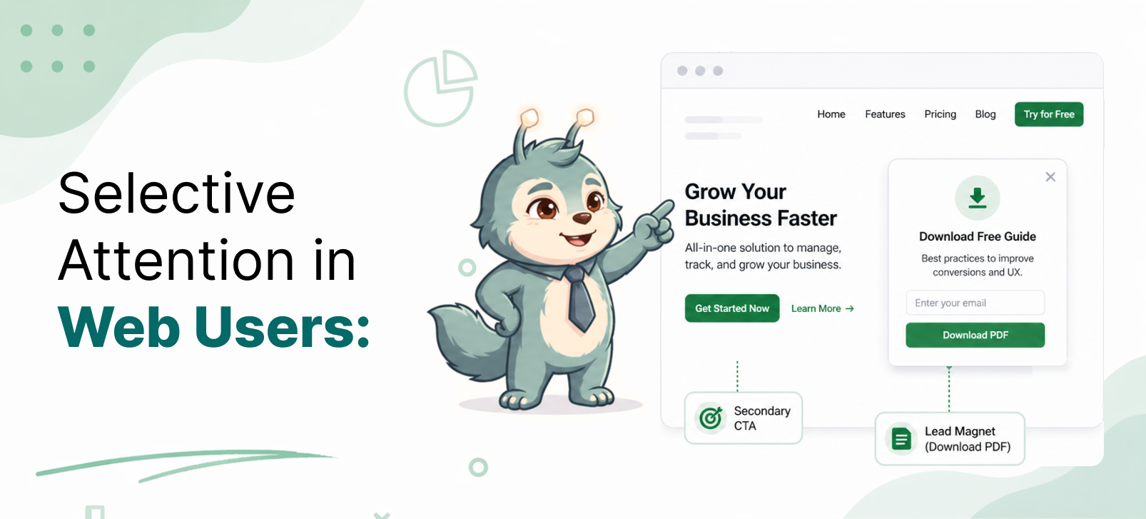
- What Works Better Than Traditional Popups
Traditional popups often appear as interruptions.
Better email capture comes from placing the prompt where attention already exists.
For example, use inline email forms inside the content.
If a user is reading about a problem, place a relevant resource inside that section.
Use prompts like:
“Want the checklist version of this?”
Or:
“Get more practical examples like this.”
This feels connected to the content.
You can also place a form at the end of the article.
At that point, the user has already received value.
The ask feels natural:
“Get more insights like this in your inbox.”
Sticky bars can also work if they are quiet and non-intrusive.
They should not block the user.They should not fight for attention.They should stay available without disturbing the reading flow.
Context-based prompts are even better.
If someone is reading a beginner article, offer a beginner guide.
If someone is reading a comparison page, offer a comparison checklist.
If someone is on a pricing page, offer help choosing the right plan.
The more relevant the prompt, the less it feels like a popup.
- The Real Lesson
Users do not give attention because you ask for it.
They give attention when:
- they receive value
- they reach a pause
- they feel a need
- your offer matches their intent
That is when email capture works.
Not because the popup is bigger.Not because the button is brighter.Not because it appears faster.
It works because the timing makes sense.
A good prompt does not interrupt the user.
It appears when the user is already thinking:
“This is useful. I may want more.”
That is the moment to ask.
- Final Thought
The goal is not to collect emails from every visitor.
The goal is to ask at the moment when the user is most ready.
Attention is not captured by force.
It is earned through value, timing, and relevance.