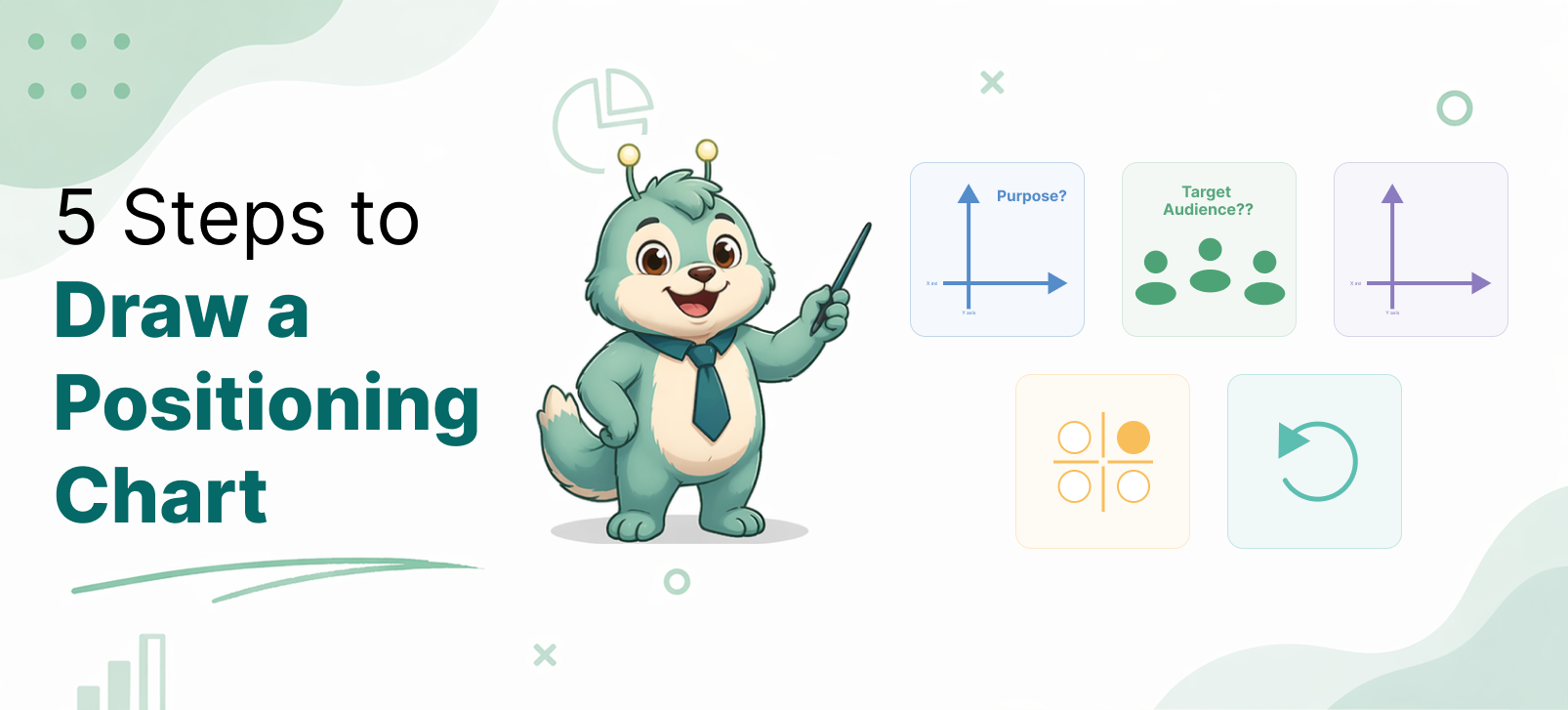
5 Steps to Draw a Positioning Chart
A positioning chart helps people understand where a product stands in the market. It gives a simple visual view of how different options compare. When done well, it can support product strategy, website messaging, sales conversations, and content marketing.
But many positioning charts fail. Some use random axes. Some force the product into a flattering spot. Some confuse buyers more than they help them.
A good positioning chart should be clear, believable, and useful.
Here is a practical five-step method to draw one.
Step 1: Define the purpose of the chart
Before drawing anything, decide why you are creating the chart.
This step matters because the purpose shapes the whole chart. A chart made for internal strategy will look different from a chart made for a sales page.
For example:
- An internal strategy chart may help you identify market gaps.
- A website chart may help buyers understand your category quickly.
- A sales chart may help explain why your product is a better fit.
- A blog chart may need a more neutral and educational tone.
Without a clear purpose, the chart can become vague. It may look fine visually, but it will not do its job.
So start by asking:
- Is this chart for internal thinking or external messaging?
- Is it for sales, marketing, education, or investor discussion?
- Should it be neutral, persuasive, or a mix of both?
Once the purpose is clear, the rest becomes easier.
Step 2: Identify the target audience
A positioning chart is never for “everyone.” It is for a specific type of viewer.
This matters because different audiences use different decision factors.
For example:
- Customers may care about usability, value, trust, and how well the product solves their problem.
- Managers may care about efficiency, team adoption, implementation effort, and business impact.
- Sales teams may care about differentiation, buyer objections, competitive comparison, and ideal customer fit.
- Enterprise buyers may care about security, governance, reporting, scalability, and vendor reliability.
The same product can look strong to one audience and weak to another.
That is why you must define who will read the chart.
Ask:
- Who is the chart meant for?
- What are their main frustrations?
- What are they trying to solve?
- What do they mean by “better”?
This helps you avoid technical axes for non-technical buyers. It also helps you avoid buyer-friendly language when the audience actually wants technical depth.
A good chart speaks the language of the audience.
Step 3: Choose the right comparison axes
This is the most important step. The axes decide what story the chart tells. Bad axes create weak charts. Good axes make the positioning obvious.
Strong axes usually do three things:
- reflect real buyer decision factors
- separate competitors meaningfully
- help explain your product category clearly
For example, if you are positioning an API testing tool for manual testers, these axes may work:
- Requires coding → Easy for manual testers
- Basic API actions → Strong automation and team workflow support
These are stronger than vague axes like:
- Traditional → Modern
- Weak → Powerful
- Complex → Simple
The second set sounds attractive, but it is too subjective.
When choosing axes, avoid labels that are:
- vague
- emotional
- self-serving
- hard to defend
Instead, choose axes that a reader can understand and accept.
A useful test is this: If someone asks why a product sits in a certain place, can you explain it clearly? If yes, your axes are probably strong enough.
Step 4: Select competitors and score them honestly
Once your axes are ready, decide which products belong on the chart. Do not include every competitor in the market. Include the ones that matter for your audience and message.
A good set of competitors usually includes:
- direct alternatives
- common substitutes
- a few well-known reference products
After that, place each tool based on reasonable judgment. Some teams do this qualitatively. Others use a scoring model. A simple scoring method is often better because it makes the chart easier to defend.
For example, if your X-axis is “easy for manual testers,” you can score each tool based on:
- UI-driven setup
- need for coding
- onboarding simplicity
- learning curve
- no-code or low-code support
If your Y-axis is “automation and team workflow support,” you can score based on:
- test reusability
- workflow structure
- collaboration
- reporting
- maintainability
- support for broader testing tasks
You do not need perfect math. But you do need consistency. And most importantly, be honest. If a competitor is stronger in one area, let the chart show it. A chart becomes more trustworthy when it does not try too hard to make your product win everywhere.
Step 5: Refine the chart for clarity and credibility
Once the tools are placed, review the chart from the viewer’s perspective.
Ask:
- Is the chart easy to understand in a few seconds?
- Are the axes clear?
- Are the placements believable?
- Is the language appropriate for the audience?
- Does the chart support the purpose defined in Step 1?
This is also the stage where you simplify labels and improve readability.
For external use, especially on websites and sales pages, clarity matters more than detail.
You may need to:
- shorten axis labels
- reduce clutter
- highlight your product subtly
- group similar tools visually
- add a small caption explaining the chart
For example, if your audience is manual testers and test managers, it is better to say:
- Hard for manual testers → Easy for manual testers
instead of:
- Code-heavy → No-code
Both may be true, but the first version speaks more directly to the buyer.
Also check for bias. A chart can become less credible if it feels too engineered.
A good positioning chart should help your product stand out naturally. It should not feel manipulated.
Final thoughts
A positioning chart is simple on the surface, but strong charts are built with care.
They do not start with shapes or dots. They start with purpose, audience, and buyer logic.
To recap, the five steps are:
- Define the purpose of the chart
- Identify the target audience
- Choose the right comparison axes
- Select competitors and score them honestly
- Refine the chart for clarity and credibility
If you follow these steps, your chart will do more than compare products. It will help people understand your market and your product’s place in it.
That is what makes a positioning chart useful.